
As part of the Cincinnati State Graphic Design program's Brand Identity class, I was tasked with creating a new logo weekly for an entity of my choosing that had no prior branding. I chose to make logos for cities and towns in my home state of West Virginia. I started the project with the intention of covering the more well-known cities, but the project took a fun, unexpected turn as I started to discover the more obscure towns with unusual names. The product was a challenging, but enjoyable exercise in quick brand identity development and a bit of hometown pride.
Week 1: Charleston
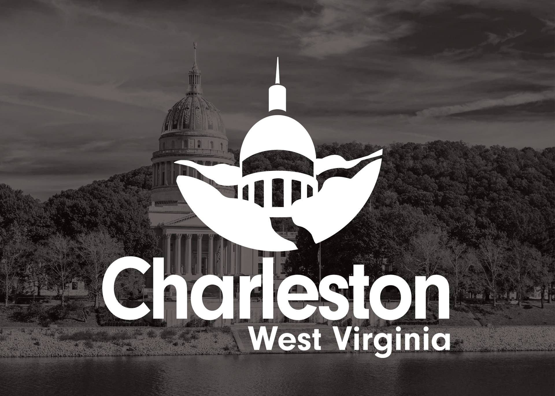
For Week 1, I created a logo for the capitol city and where I grew up, Charleston. Prominently featured is the distinctive Capital building, with its gold dome nestled between the mountains. I wanted to create the feeling of being surrounded by the mountains like one is as they drive through the city center of Charleston, with its winding highways wrapping around the rock formations.
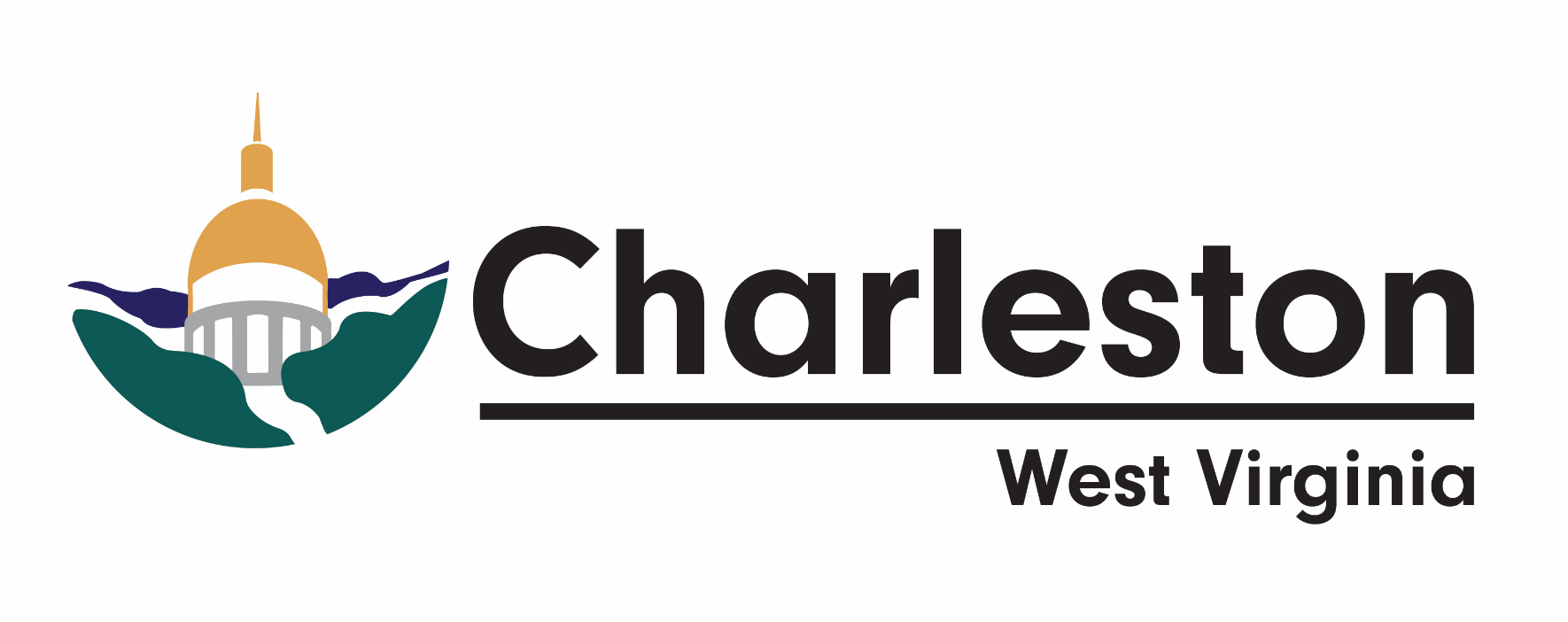
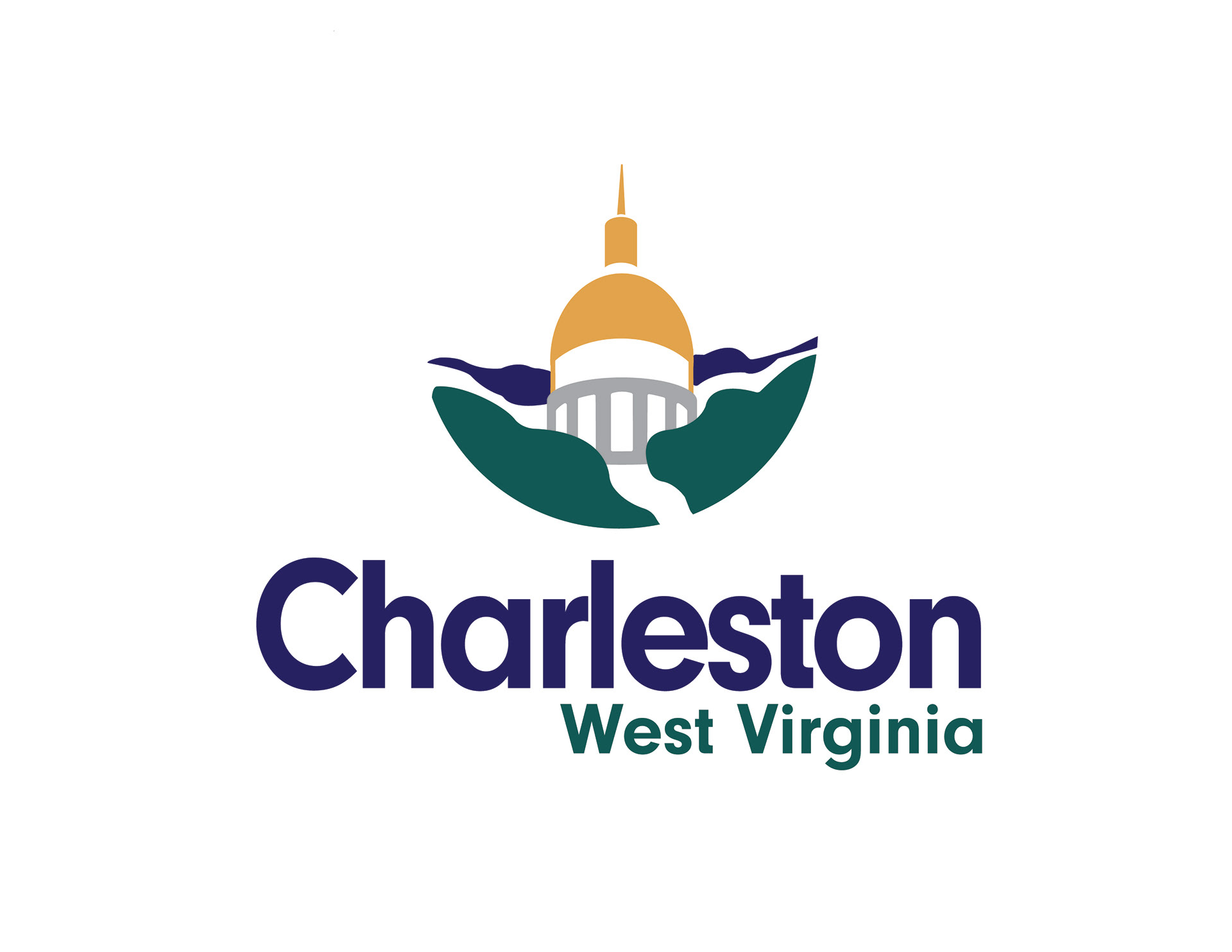
L to R: Vector Rough, Finished Logo
Week 2: Beckley
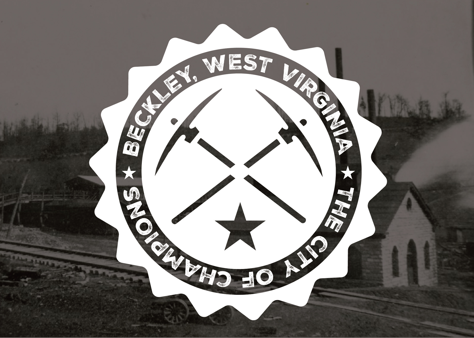
Beckley, West Virginia is historically a mining town tucked into the coal fields of the southern part of the state. The city is now home to an exhibition mine, in which visitors can go down into an actual mine to gain perspective of an average day of a coal miner hundreds of feet below ground. The mine itself is in a preserved company town, where visitors can also imagine a day in the life of the family of coal miners. As you can imagine, this was always a really fun field trip and a rite of passage for West Virginian youngsters to visit the Beckley Coal Mine with their classes.
This design was inspired by vintage union badges, particularly miner's unions, which also originated in West Virginia, and were kickstarted after the Battle of Blair Mountain in 1921. (Can you tell yet that I had two mandatory years of West Virginia history in school?)
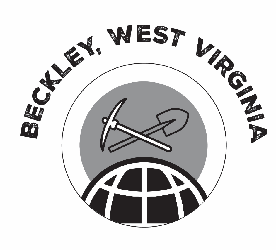
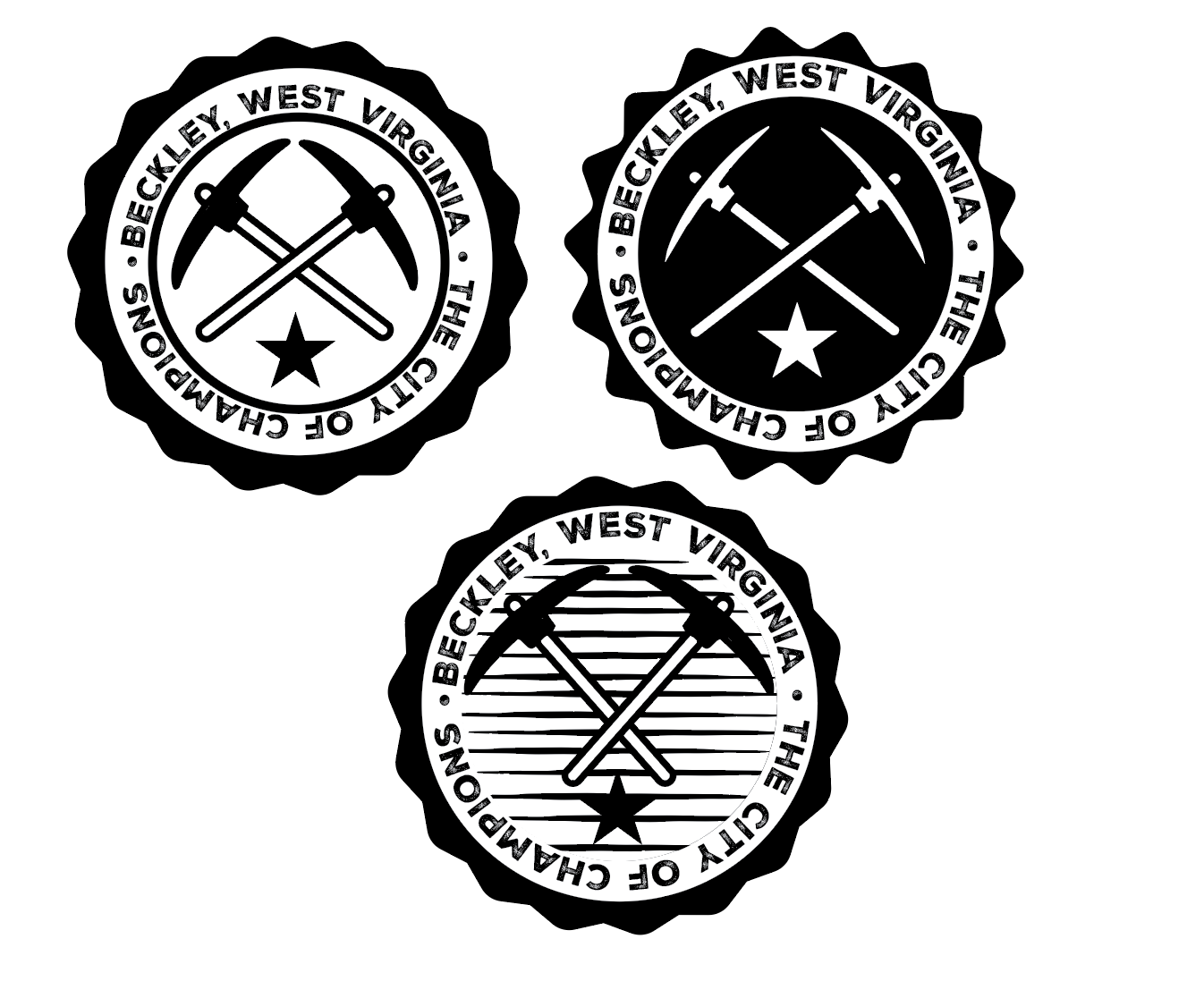
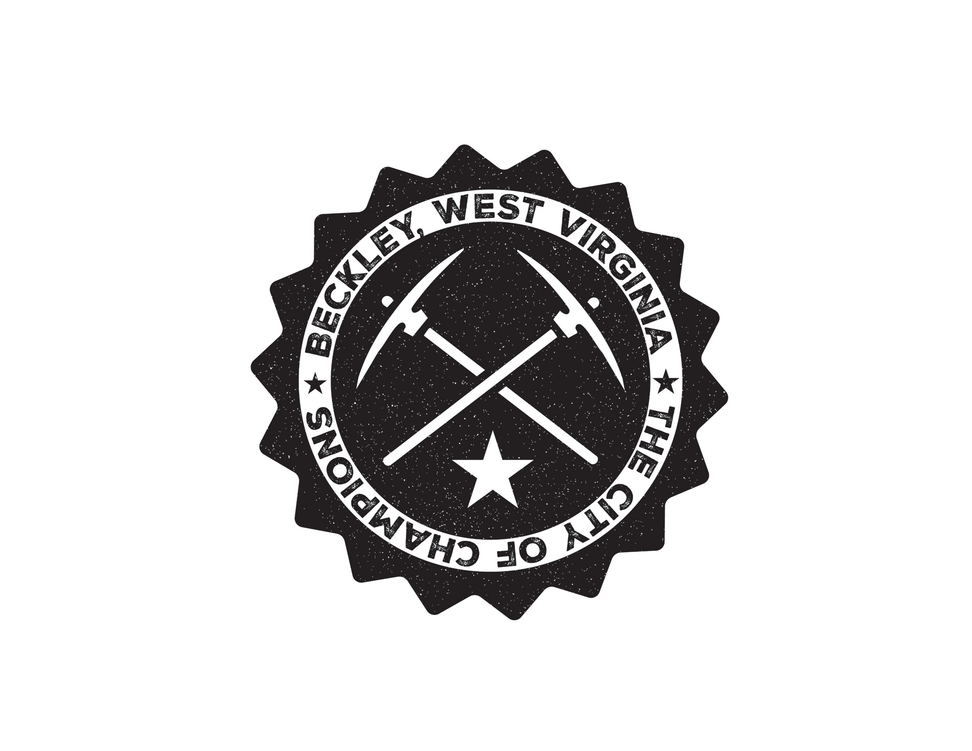
L to R: Inspiration Board, Vector Rough #1, Vector Rough #2, Final Logo
Week 3: Circleville
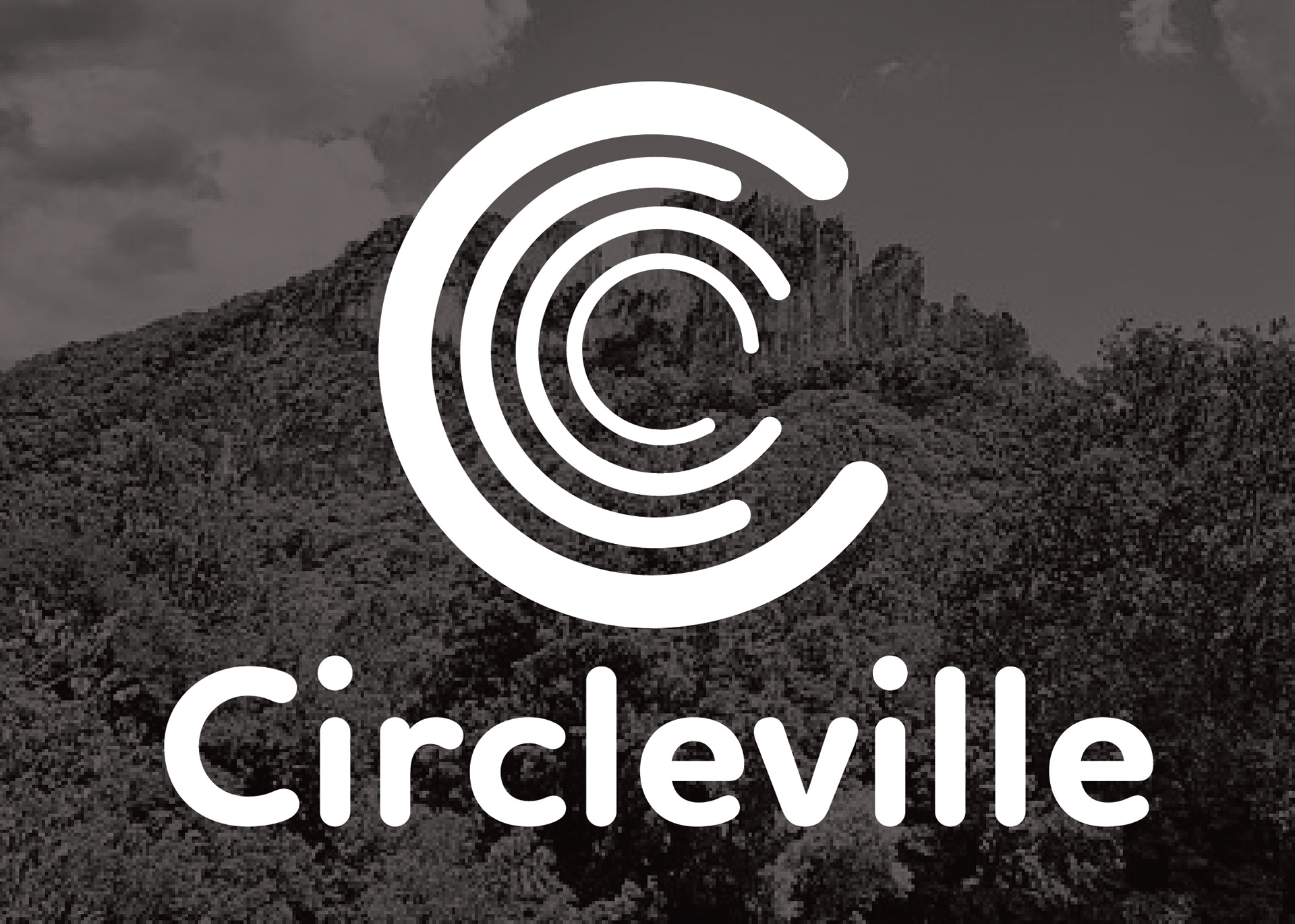
Circleville, West Virginia (not the be confused with the more prominent, pumpkin festival-hosting Circleville, Ohio) is an unincorporated town near the eastern panhandle of the state. It was originally named Zirkleville after John Zirkle, a dry goods store owner in the town, in which Circleville's was later anglicized to the version we know now.
Writer John O'Brien described the town in his 2001 book At Home in the Heart of Appalachia as a "lonely outpost in the ice-cold mountains."
The concentric circles were used to symbolize the town's name, while also demonstrating harmony and organization in community.
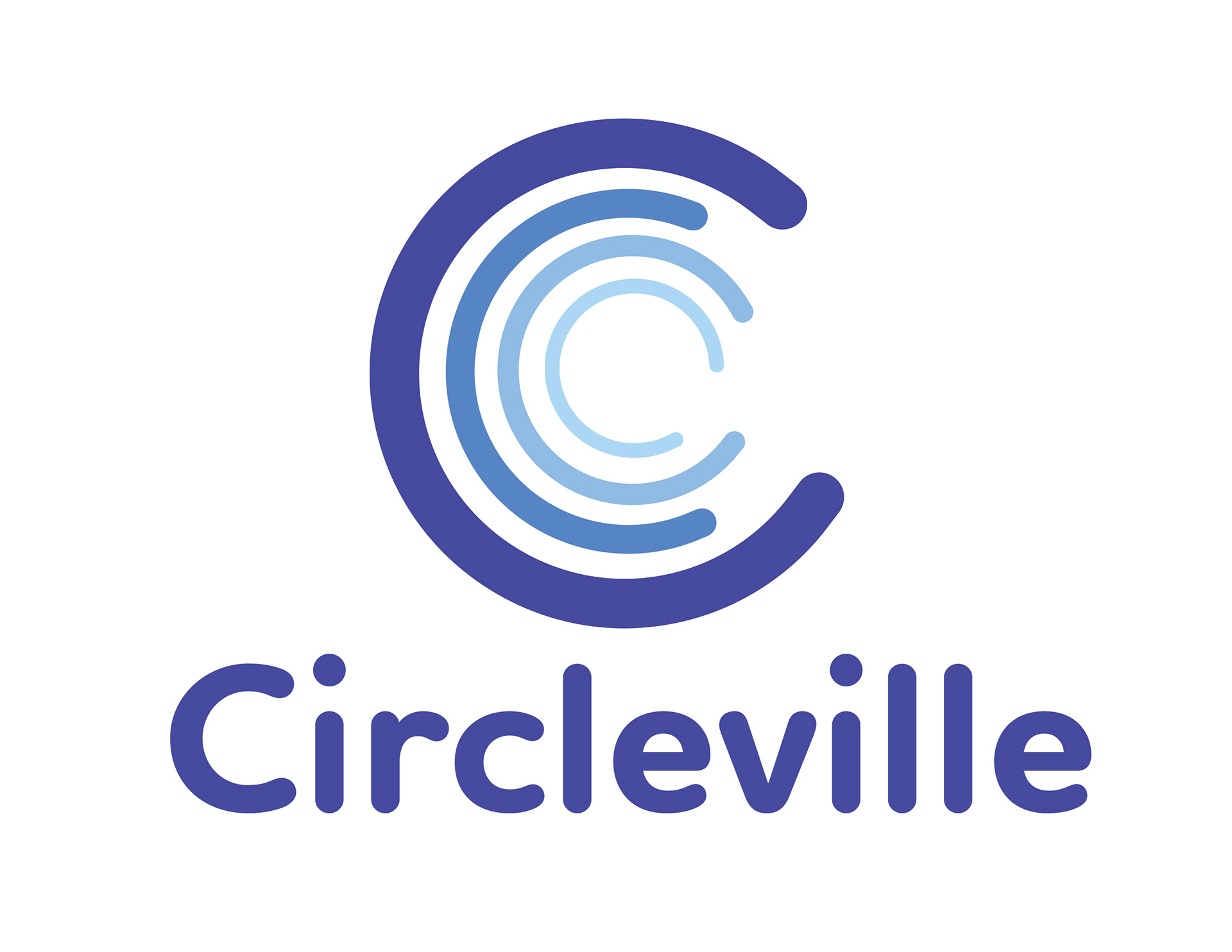
Final Logo
Week 4: Morgantown
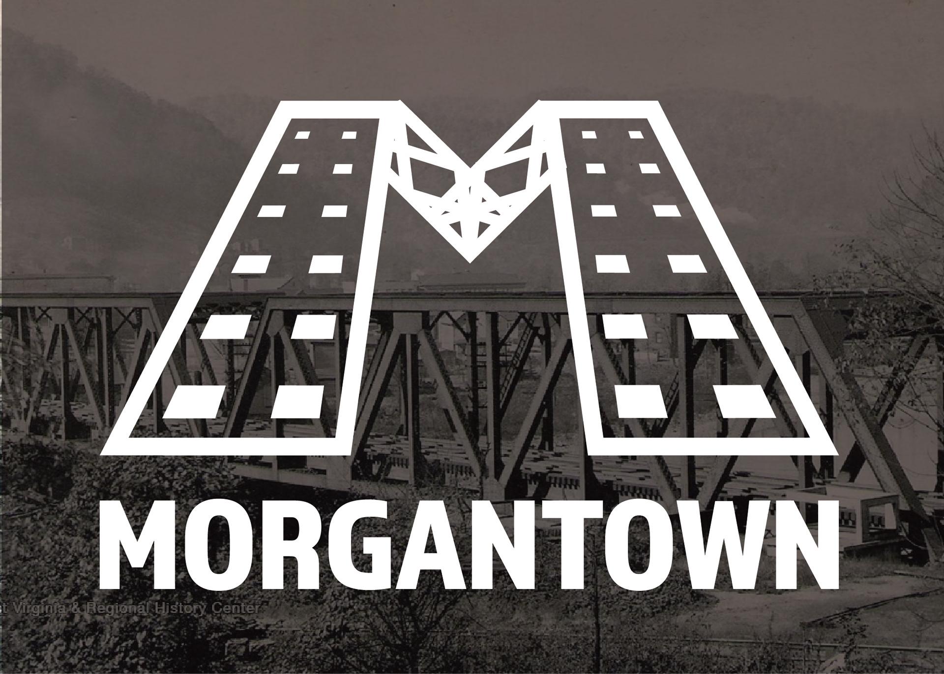
Morgantown, famously known as the home to West Virginia University and the Mountaineers. Morgantown is also known as being one of the first industrial hubs of the state, partially due to its close proximity to another city of industry, Pittsburgh. This logo is modeled after the Baltimore and Ohio rail bridge, connecting Appalachia to major commercial hubs through shipments of coal, lumber, and building stone.
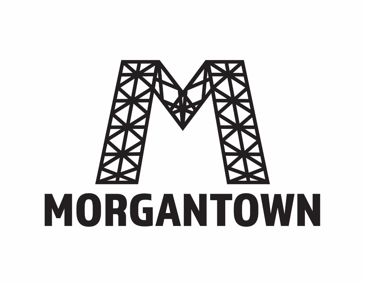
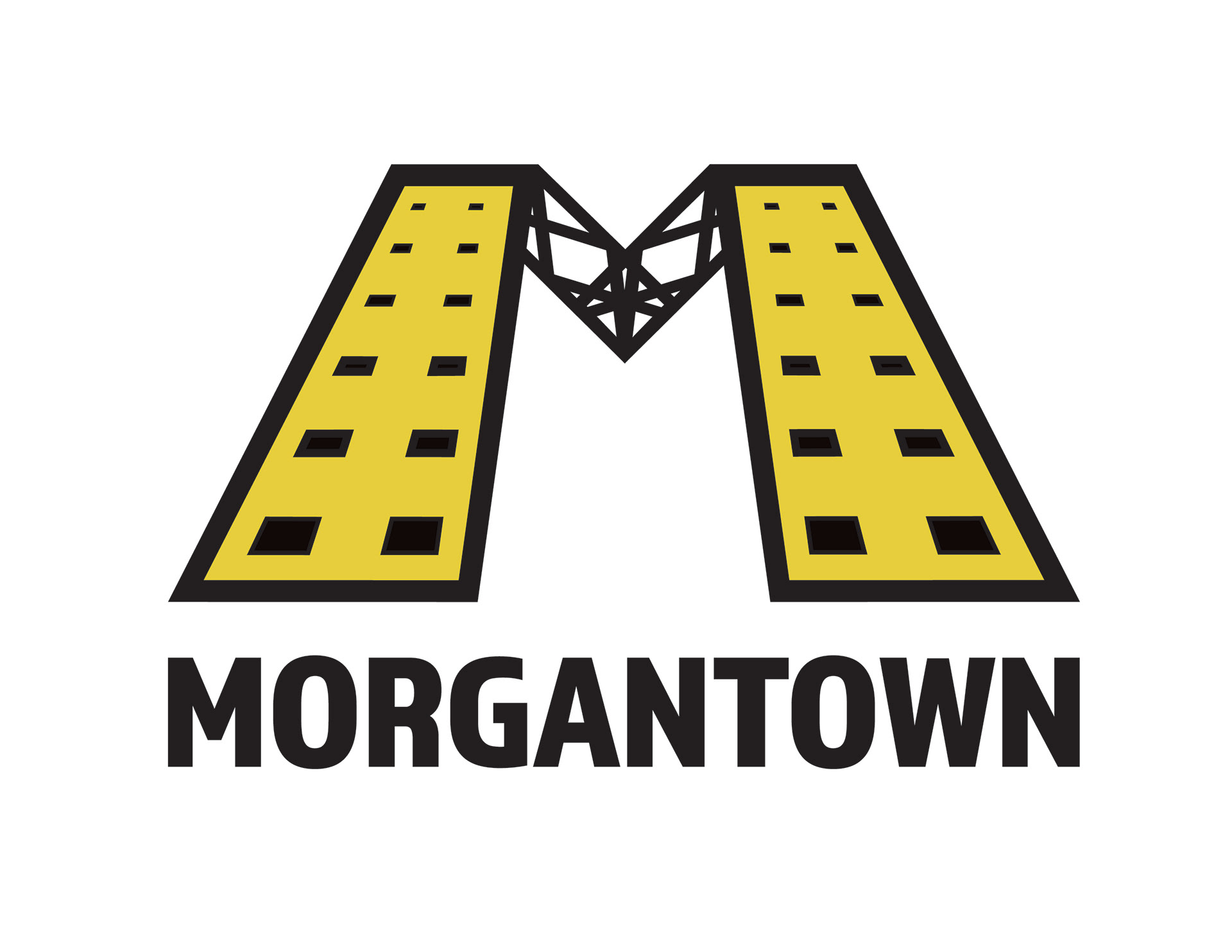
L to R: Initial Vector Rough, Final Logo
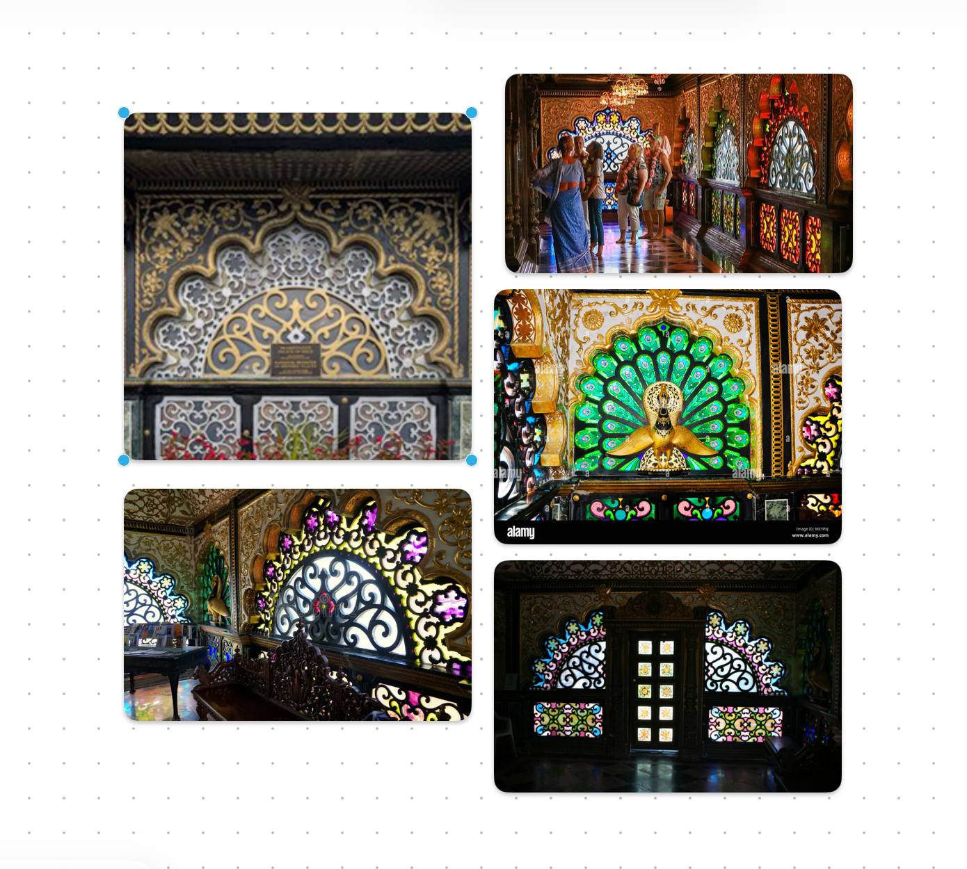
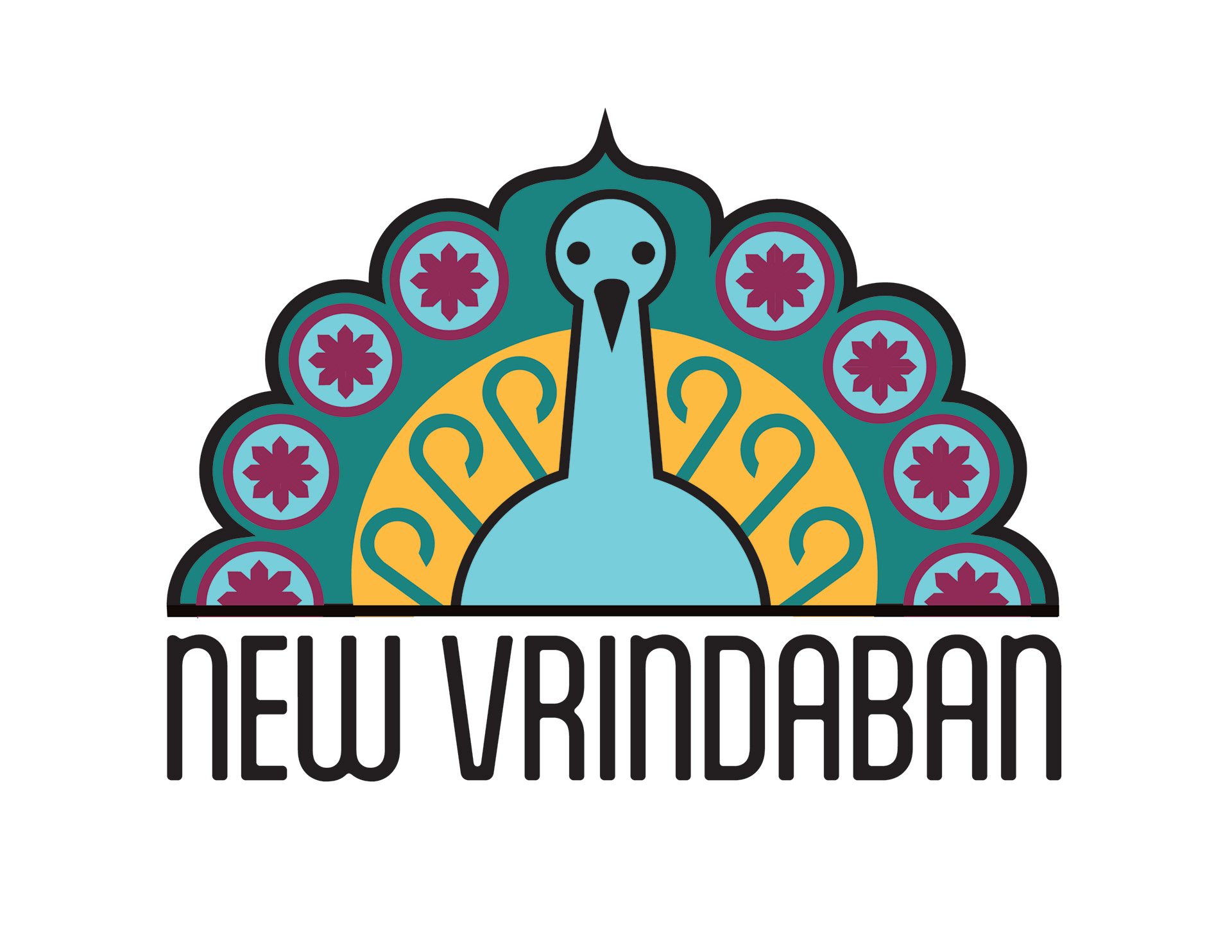
Week 5 : New Vrindaban
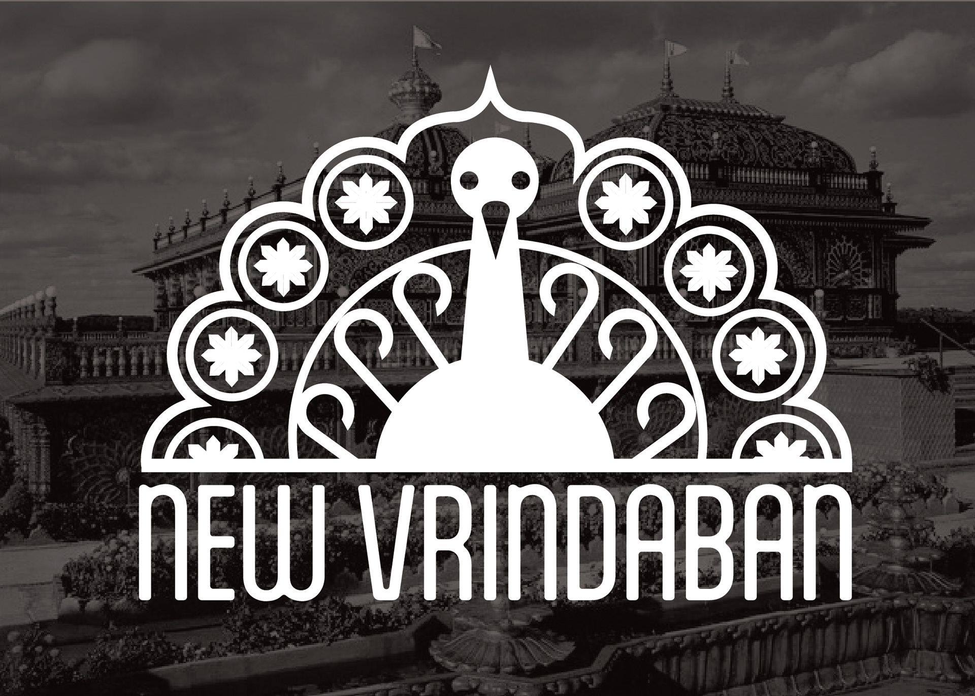
New Vrindaban is one of my favorite towns in the state with a fascinating history. The town was founded in 1968 by a community of Hare Krishnas looking for area in which they could build a new temple. Thus the Golden Palace was created, built entirely by Krishna community members deep in the mountains and named after the Indian town of Vrindaban. The temple is open to the public and worth a weekend trip.
This logo was inspired by the stunning stained glass work that is seen throughout the temple, as well as the peacocks that roam the grounds to welcome visitors.
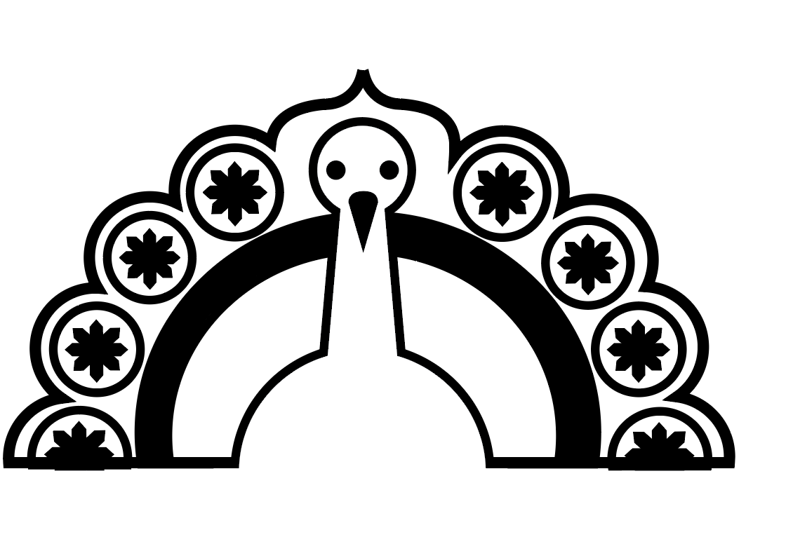
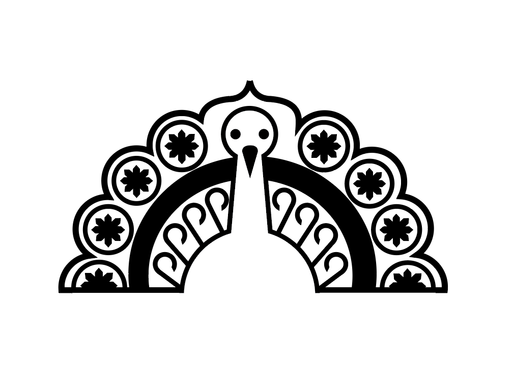
L to R: Inspiration Images, Vector Rough #1, Vector Rough #2
Below: Final Logo
Week 6: Burnt House
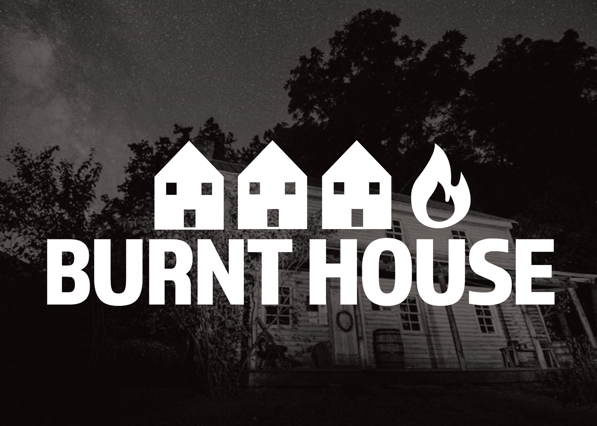
Burnt House is a very small town in Ritchie County unfamiliar to me before I started this project. The town was named after a tavern that burned down in 1840.
I wanted to create a very modern logo in contrast to a very old town, which also being a little tongue-in-cheek with the design.
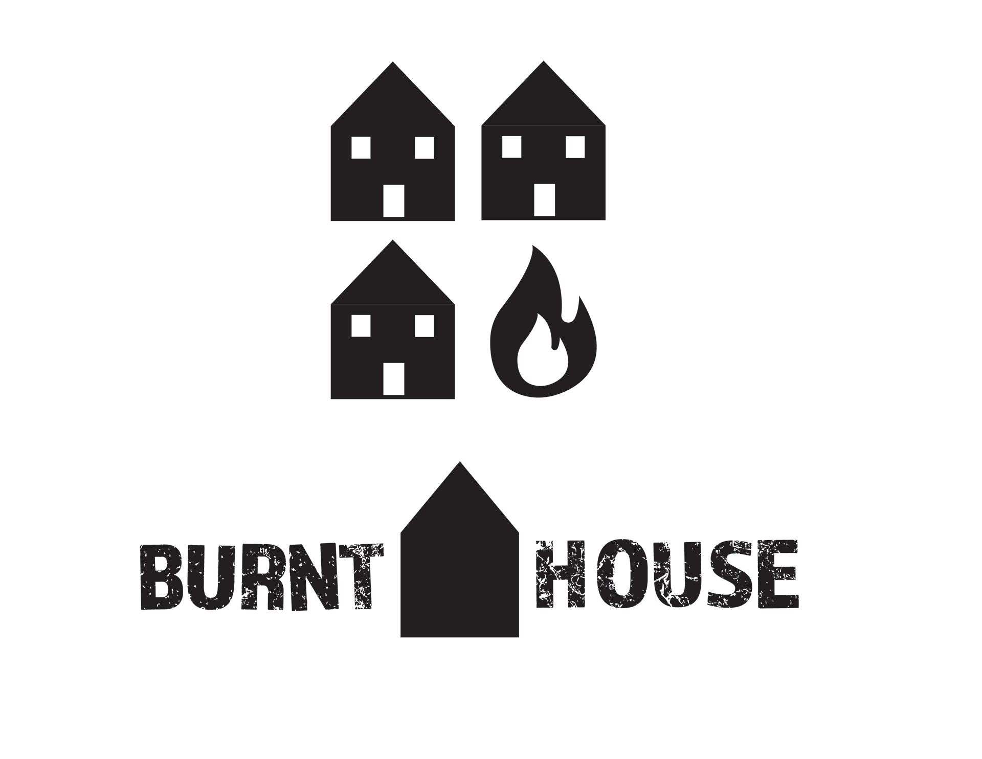
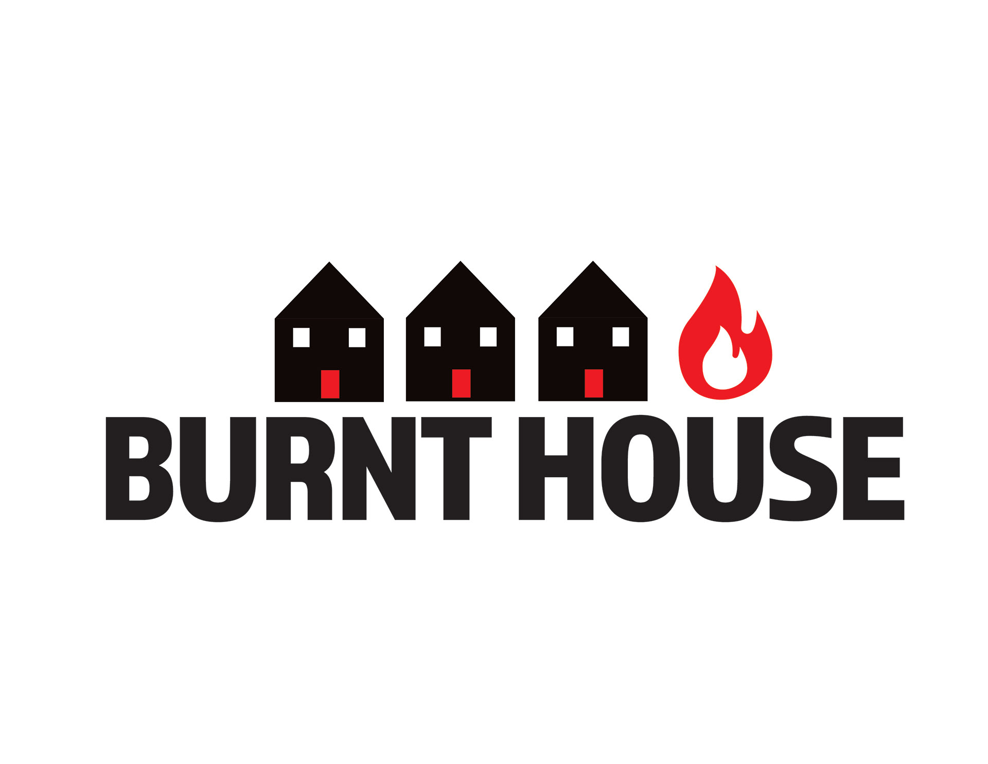
L to R: Vector Roughs, Final Logo
Week 7: Parkersburg
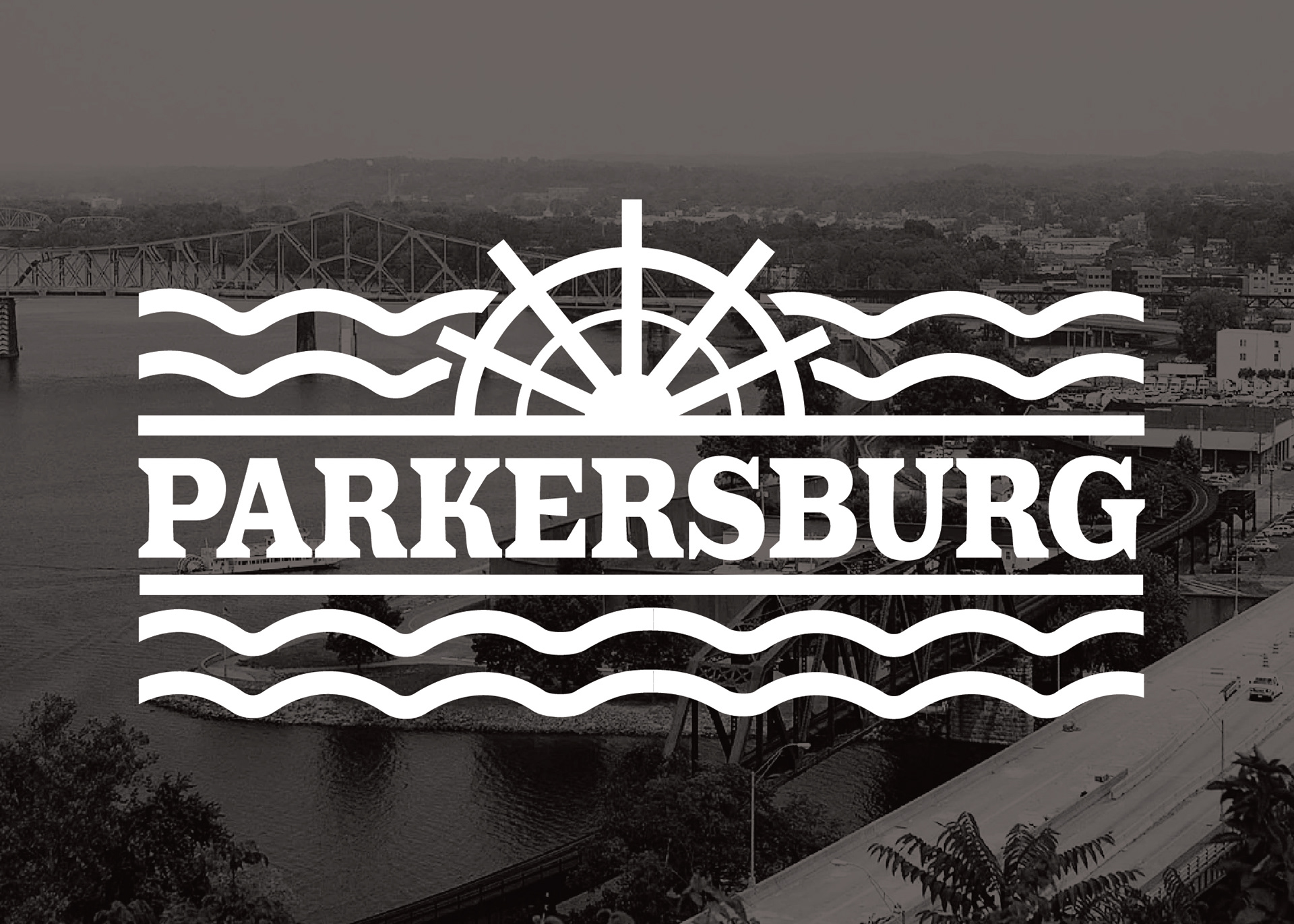
Parkersburg is one of West Virginia's oldest cities, serving a pivotal role in the Civil War as a base camp for Union troops. During the Industrial Revolution, the area was rich in manufacturing, the production of oil and natural gas, and the transportation of commerce through their connections to the railways and rivers. Parkersburg still celebrates sternwheel boats and their contributions to the founding economy of the city.
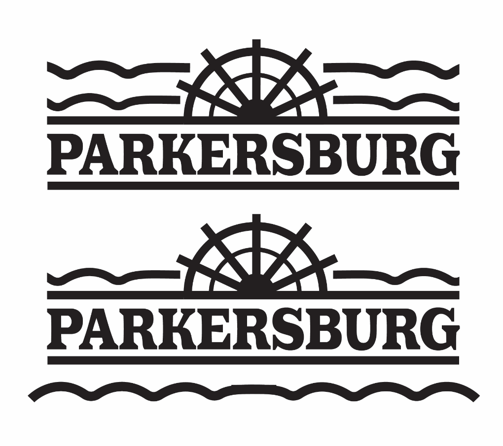
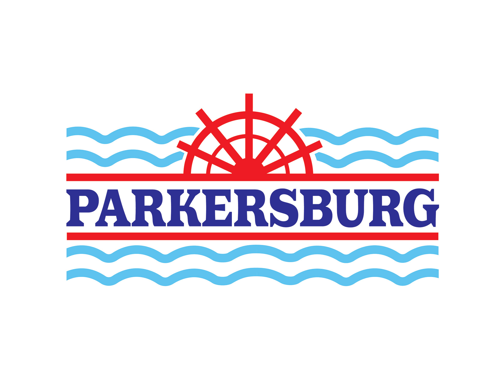
L to R: Vector Roughs, Final Logo
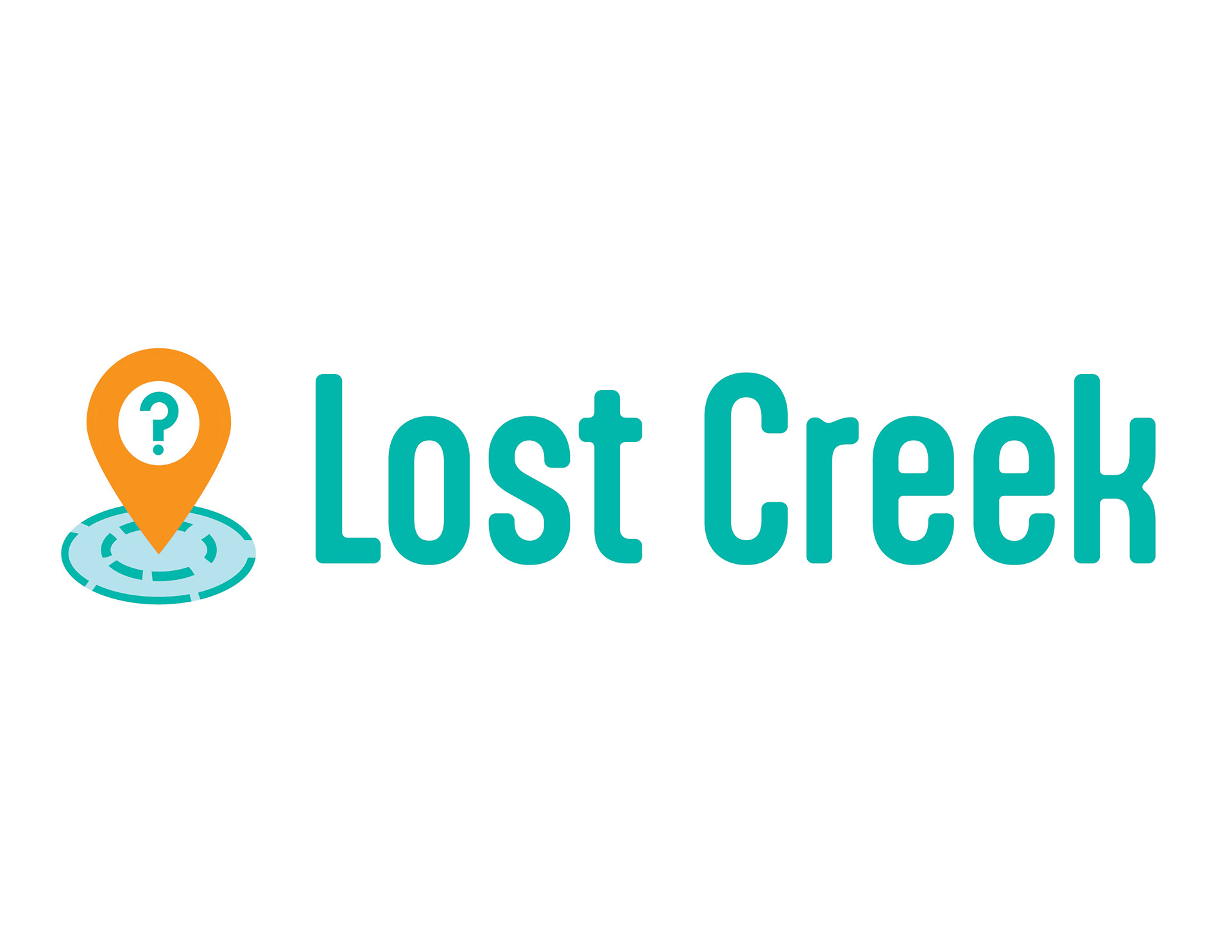
Week 8: Lost Creek
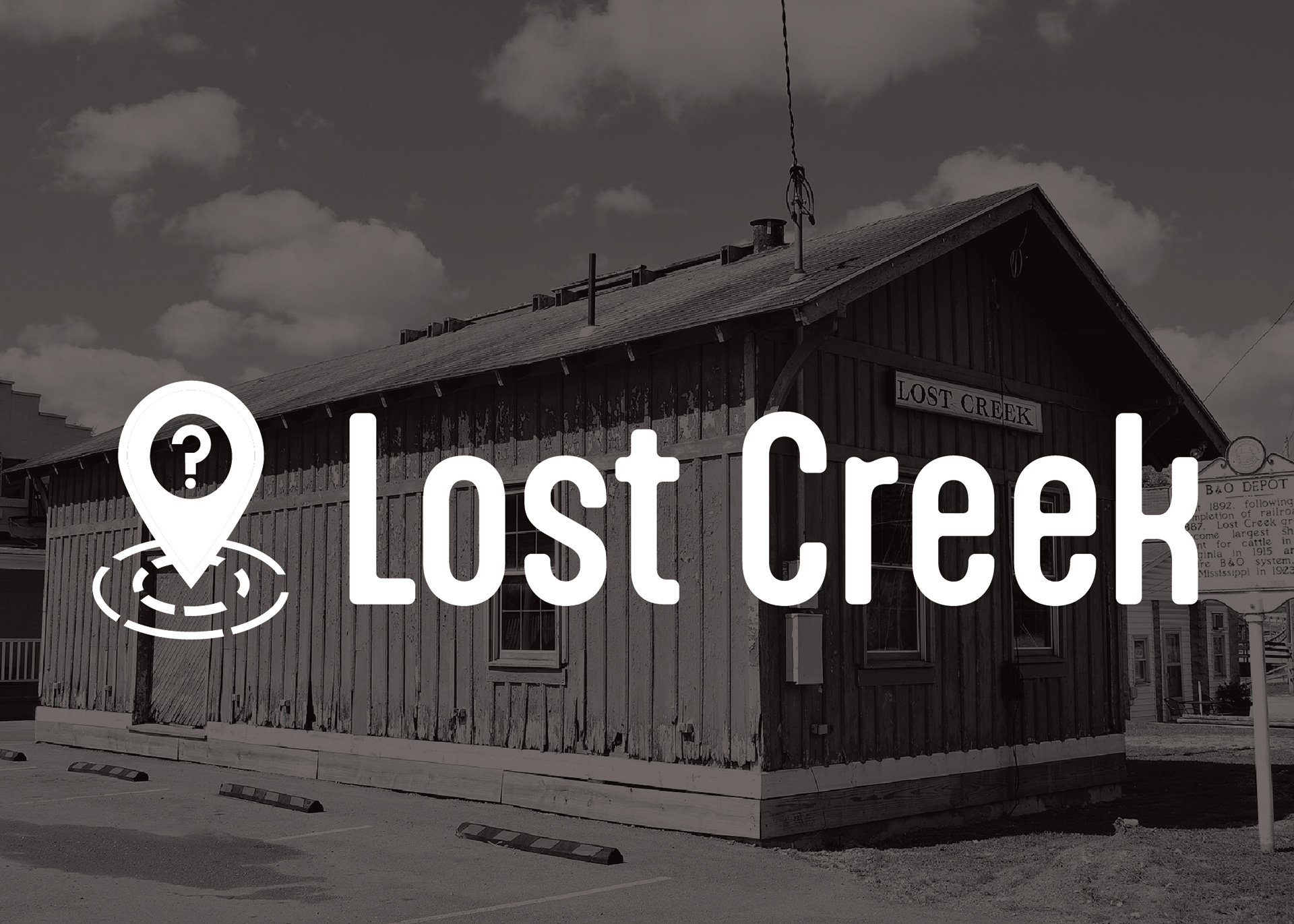
Lost Creek is another new-to-me town with a cool name in the northern part of the state. The story of the town's name derives from a nearby creek of the same name, derived from messages carved into trees by lost European Settlers.
I wanted to create a logo that looked like it could be a logo for a navigation app, and played off of the notion of knowing your location but still being lost, much like the original settlers of the region.
Final Logo
Week 9: Flatwoods
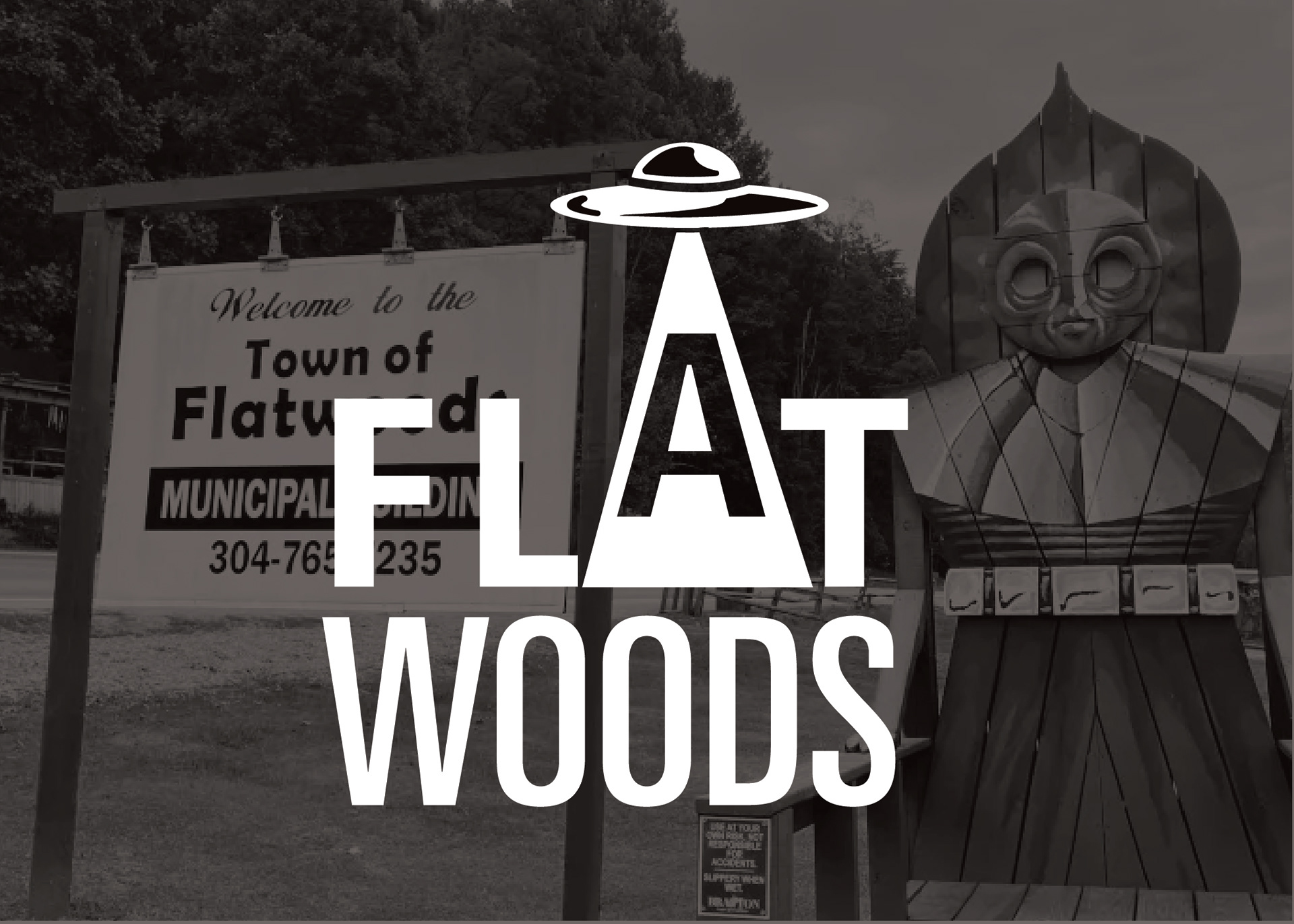
Flatwoods is the home of notorious cryptid, the Flatwoods Monster, who is implicated in an alleged UFO abduction believed to have taken place in 1952. To honor the eccentricity of this notoriety, I created a logo to depict this part of the town's history, a folklore that has become embraced and beloved in the community.
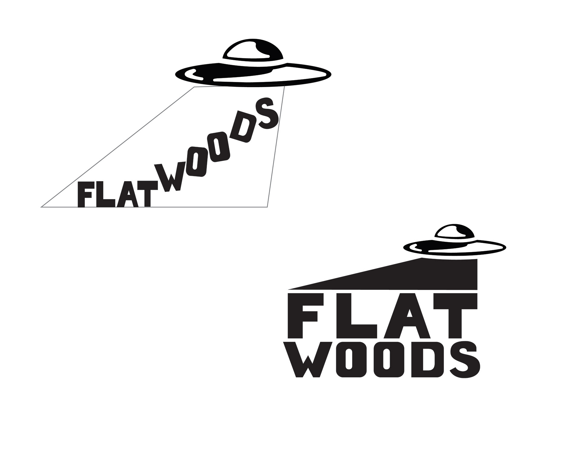
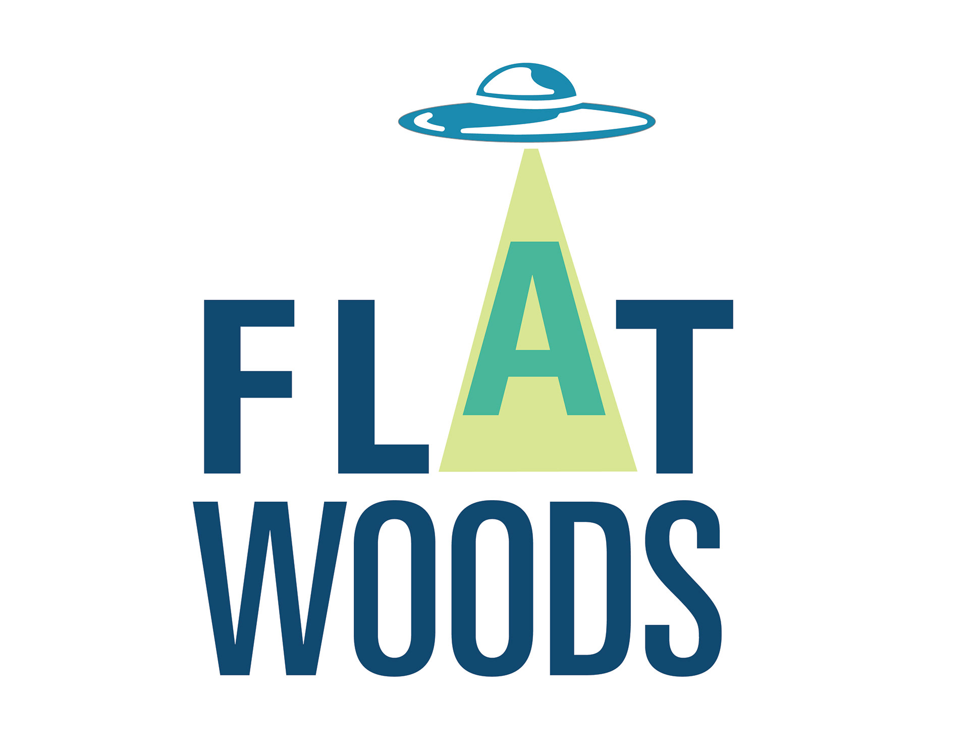
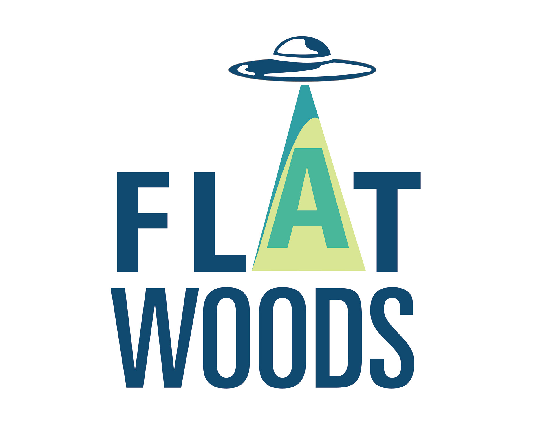
L to R: Vector Roughs, Final Logo
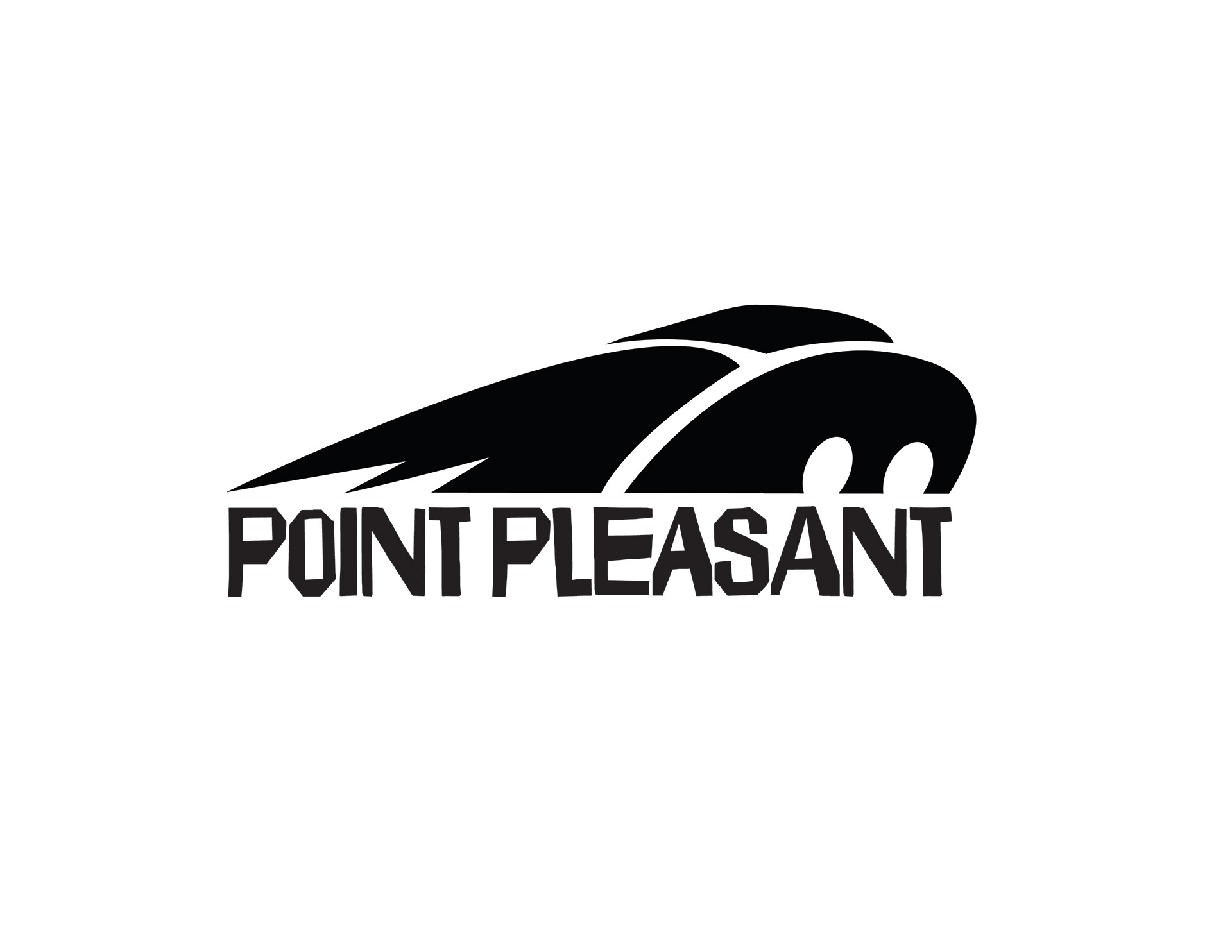
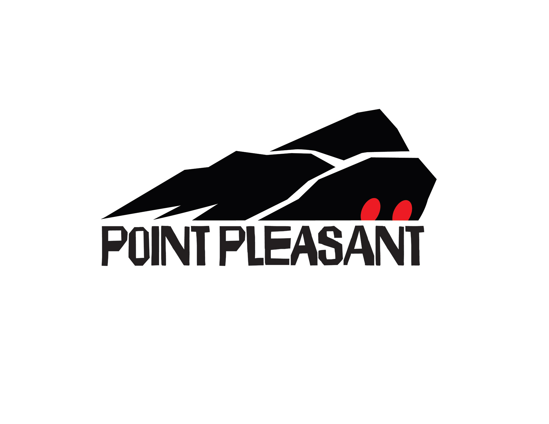
Week 10: Point Pleasant
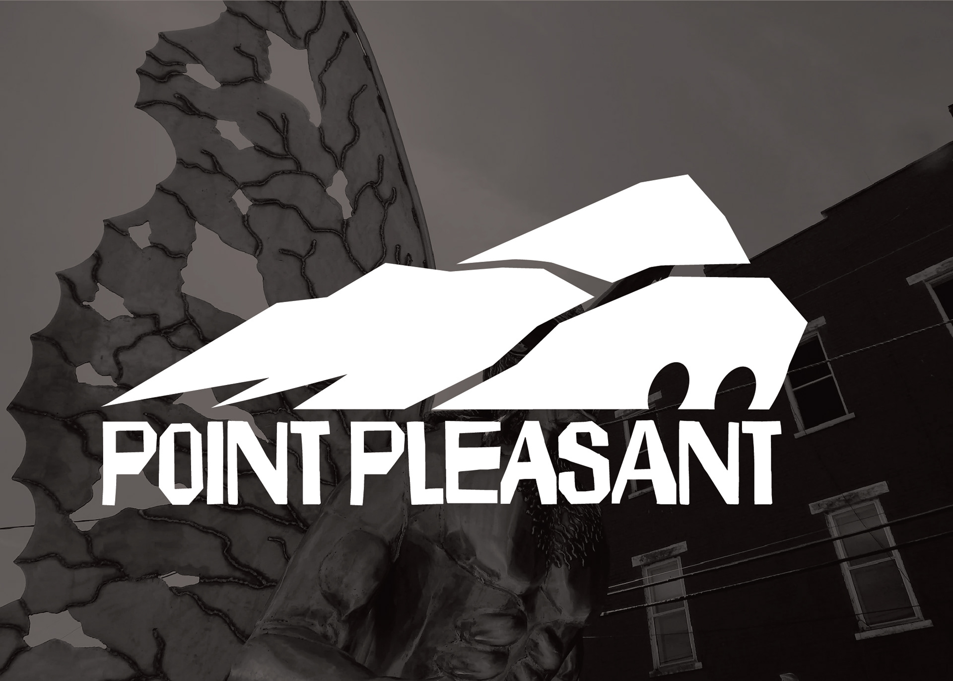
Point Pleasant is the home of internationally adored cryptid, the Mothman, who alleged caused the Silver Bridge to collapse in 1967. Whether or not the bridge failed due to supernatural interference or a defective eyebolt, the Mothman has been claimed by the town of Point Pleasant, which celebrates the man-moth beast annually with their Mothman Festival. A gigantic silver statue was erected in the town square to continue the adoration for Mothman beyond the festival.
For this logo, I wanted to create something that communicated the quirkiness of the town, while alluding to the mountains that surround the area. The result is this funky, irregular mark with glowing red eyes.
Week 11: South Charleston
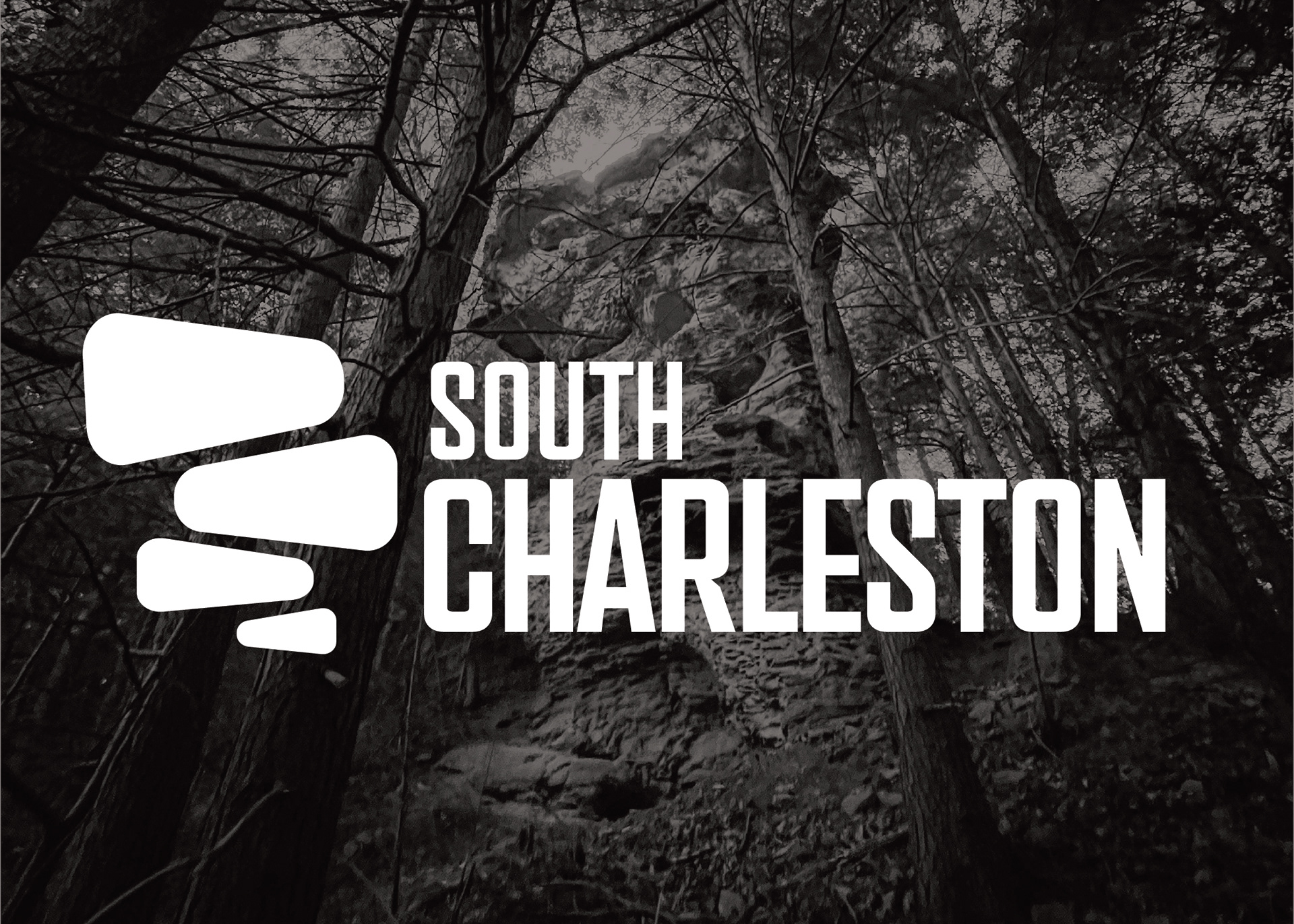
South Charleston––neighbor of, but not to be confused with Charleston––has it's own post office, identity, and oddly-shaped rock forms. In this instance I'm talking about the Devil's Tea Table, a gravity defying stack of boulders created through erosion. This form is a fixture of the town, tucked in Little Creek Park.
I aimed to create a stylized, mid-century modern logo depicting the rock form in an abstract, but recognizable form.
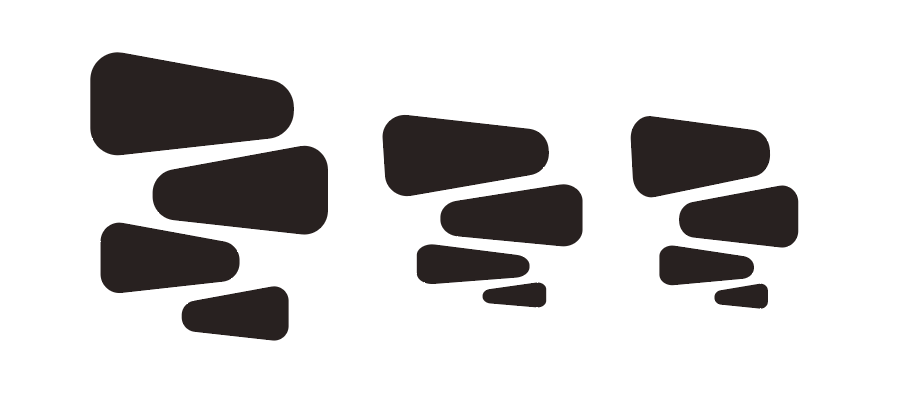
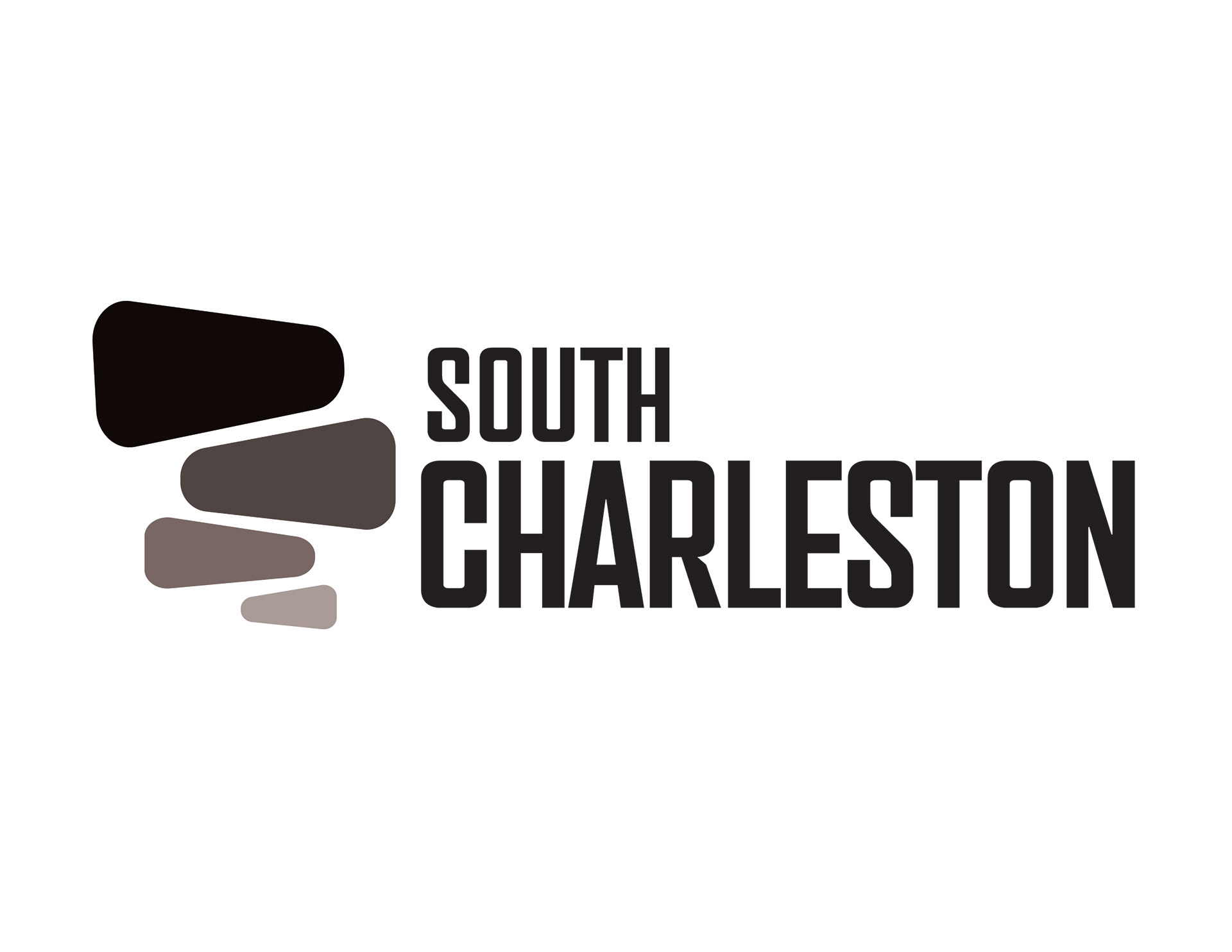
L to R: Vector Roughs, Final Logo